Chapter 14 CC18
Download Materials for Chapter 14
Click here to download chapter 14 work files.
Chapter 14. Multiple Pages: Tension, Chaos, Disarray
A common exercise in print design is the tri-fold brochure. A trifold is one page of paper, folded twice at one-third of the length or height of the printed page. Typically this is first done on a standard letter size sheet of paper in landscape orientation (11 by 8.5 inches). The folded areas can be thought of as "gutters," where you would normally want to avoid placing text. Images can run across a fold, but only if they are much larger than the folded area.
For this chapter, we will use the tri-fold brochure as the platform for an approach to graphic design that resists the rules of the grid. Creating tension with a sense of chaos among type and images was part of the Futurist, Constructivist and Dadaist anti-art aesthetic in the early 20th Century. The urge to stray from the rigid surface of the grid resurfaced in the latter part of the 20th Century when designers took a vested interest in a more subjective interpretation of the content that they were designing. Neville Brody's work on Fuse Magazine and David Carson's Ray Gun Magazine are examples that can not be left out of this paragraph. It is important to note that although the aesthetics in Brody and Carson's work feel as chaotic as a montage by Hannah Hoch or Raoul Haussmann, the Dadaists (especially the Germans) were motivated by their passionate feelings about World War I and the Industrial Revolution. The designers in the late 20th Century were responding in a visual manner to a sense of stagnation in graphic design.
Carson's work is often referred to as "deconstruction" in graphic design. In Hillman Curtis' documentary short film about David Carson (you can view it here at the time of this writing: (http://www.hillmancurtis.com/index.php?/film/watch/david_carson/), Carson says, ""When I started doing magazines I just did what made sense to me. I read an article and tried to interpret it...So as we get more computerized, I think it becomes more important than ever that the work become more subjective, more personal...so that you pull from who you are as a person and put that into the work."
Deconstruction is also a philosophical movement lead by Jacques Derrida in the 1960s in which the structure of a linguistic system is revealed through a critical analysis of its application. Carson's interpretation of the essays he designed in Ray Gun attempted to expose the underlying meaning of the copy with graphic design. His method of using graphic design to reveal the meaning of a text is similar (albeit by using a different methodology) to Derrida's notion of deconstruction.
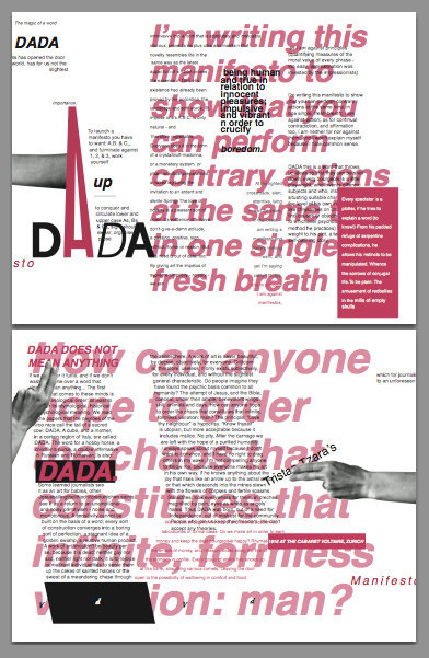
While the trifold is often considered anything but experimental, we will approach it with deconstruction in mind. The copy to design is part of Tristan Tzara's Dada Manifesto (included on the disk and available on the web). The first exercise is the front side of a single page. The second exercise is the layout for the back of the page. When you finish the exercises you can print out page one, turn the paper over, and print page two on the back. Fold the paper in thirds and you will create a trifold. As the design approach is chaotic, tense, and full of disarray, some of the text will be covered by other portions of the type. Images may cover words. Type will be set in narrow columns and hierarchy is established through contrast, scale, and value.
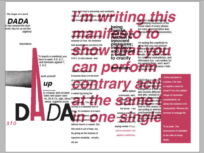
Images of the Final Pages in Both Exercises
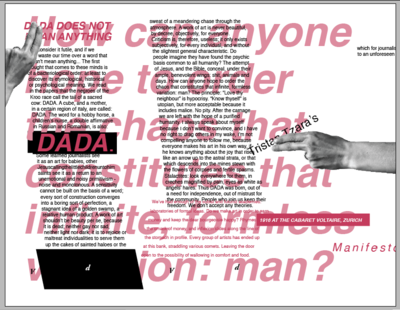
When both exercises are complete, the InDesign file contains two pages. Print page one on a sheet of paper and page two on the back of the same page then folded the single sheet in thirds to create a tri-fold.
Exercise 1: Using Images, Text Boxes, and Type to Create Tension
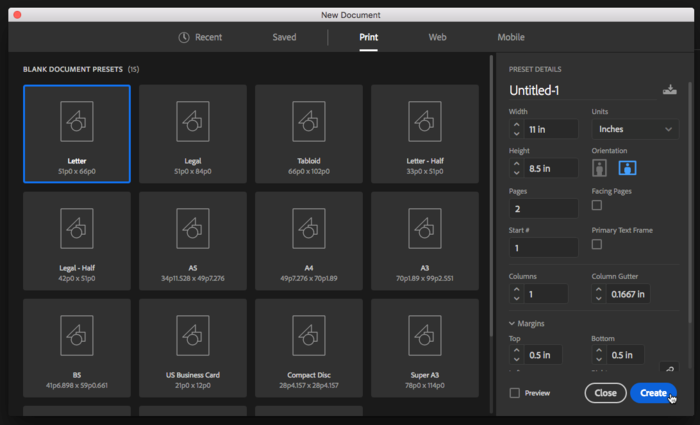
1. Create a new document with 2 pages. Do not check the facing pages or master text frame options. Use letter size set in landscape orientation.
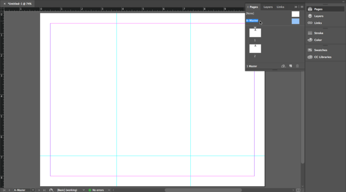
2. Double-click on the A-Master page in the Pages Palette. Pull two guides on A-Master from the left ruler with the Selection Tool to divide the page into thirds by placing the two vertical guides at 3 3/4 and 7 3/8 inches. Add a horizontal guide at 7 inches by pulling from the top ruler.
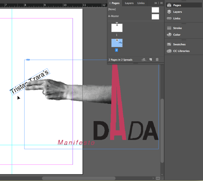
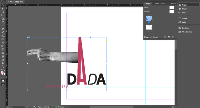
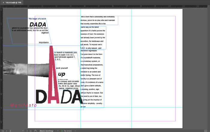
3. Double-click on Page 2 then click File > Place to import the graphic named “dada-title.ai”. Remember that File > Place creates a loaded cursor, so you have to click the mouse to load the image onto the page. On page two, the baseline of the word, “Manifesto” should rest on the guide at seven inches. The “e” in Manifesto will barely touch the edge of the page.
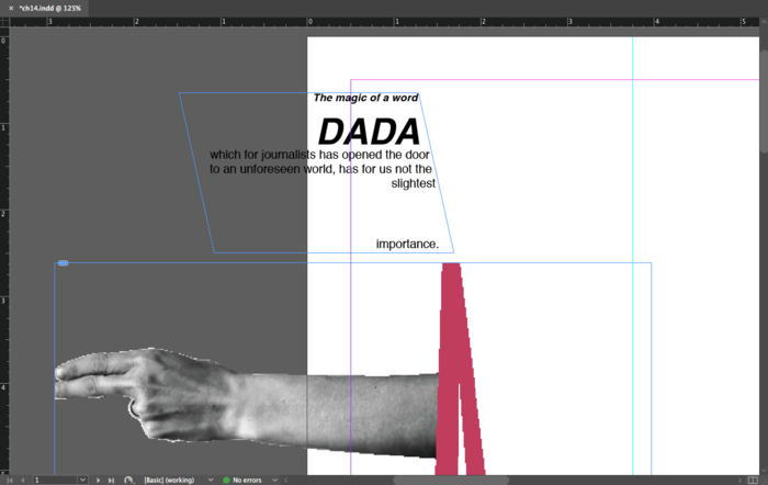
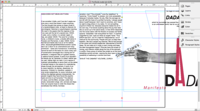
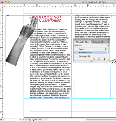
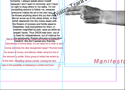
Create a text box and type “Tristan Tzara’s”. We used the type face Helvetica in the style Regular at 24 points and leading set at 28.8. For the rest of this chapter we will refer to the font face, style, point size and leading like this: Type face style size/leading. For example, we used Helvetica Regular 24/28.8. Send the text box to the back using Object > Arrange > Send to Back. Place the text just beneath the fingers as in the image below. Click on the Rotate Tool in the Tool Palette and click and drag to the left on the type box. The rotated text is the only element on this folded part of the page that is not on a horizontal or vertical grid. The rotation creates contrast. Even though the letters are partially hidden beneath the fingers, the viewer is directed to the typography. Contrast is created due to the break in repetitive use of the grid.
4. Click on the title graphic and press CMD+C to copy it. Double-click on Page 1 in the Pages Palette. Press CMD+OPT+SHFT+V or Edit > Show All Menu Items > Paste in Place. The graphic is now in the same relative position on both pages. On page one, hold SHFT and use the Selection Tool to move the graphic to the left margin. Notice where the letter “e” in “Manifesto” is in relation to the left margin.
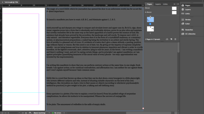
5. Create a new text box on the Artboard, far outside of page one. While the cursor is blinking in the text box, click File > Place. Choose the Word document, “dada-manifesto.doc.” File > Place can be used to load the cursor with text or images. All of the body copy is loaded into this text box.
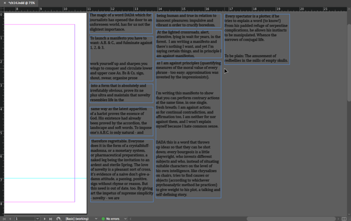
6. For this tri-fold, we will work within separate text boxes, also called “frames.” We will link the text frames just as we did in chapter 13, but this time we will set breaks in the frames so the amount of text in the frame does not change when the shape of the frame is modified. A frame break is like a page break in Microsoft Word.
Put the cursor at the end of the word “importance” and click Type > Show All Menu Items > Insert Break Character > Frame Break. The frame ends at the end of this word. Use the Selection Tool to click on the red plus sign at the right edge of the frame, the cursor is loaded with the rest of the body copy. Draw a new text box. In the new frame, place the cursor at the end of the word, “prose.” Set a frame break. Repeat this process at the words, “the,” “and,” “novelty- we are,“ “boredom,” “manifestos,” and “story.” Be sure to not modify any of the text as it will cause the text in the following frames to move.
| TIP: To undo a frame break, use the DEL key. |
There will be 9 text frames. This is a better method than copying and pasting from the Word Document to separate text boxes in InDesign because the frames are linked together, so it is less likely text will be missing or excluded. Create one more frame for the text beginning with, "DADA MEANS NOTHING" and place it on page 2. Return to page one.
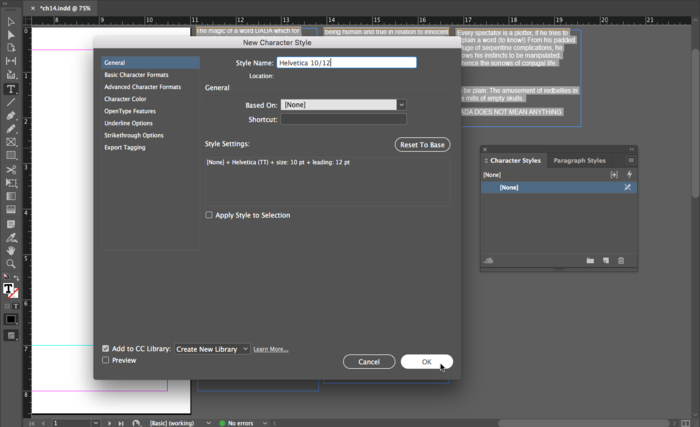
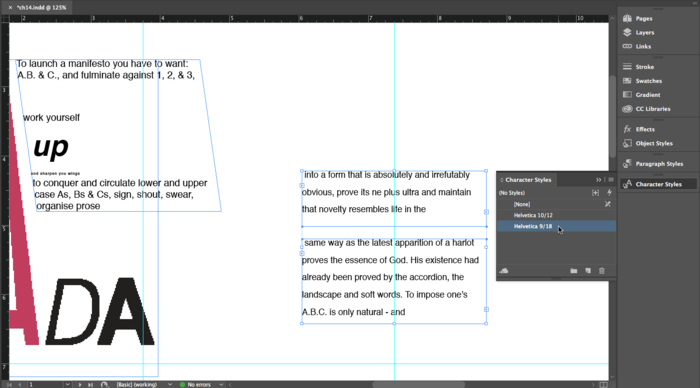
7. Insert the Type Tool in the second text frame, then press CMD+A or Edit > Select All. The entire copy is selected within the text frame. Modify the font in the Control or Character Palette to Helvetica 10/12. Click on the “New Style” icon in the Character Styles Palette to add a new style. Styles save typographic settings. With one click you can apply a style that includes the type-face, style, size, leading, kerning and more.
Caption: The Style Settings display the options that are saved in this character style. Use the menu on the left to make changes to the style.
8. Modify the text in the first text frame. We’ll use Helvetica as the font face for the entire chapter. Select all of the text in the frame, then click the Right Align button in the Paragraph Palette. Set “DADA” at Helvetica bold oblique 30. Set “The magic and importance” in Helvetica oblique 9. Increase the leading for the gap between slightest and importance. With the Direct Select Tool, click on the lower right anchor point and drag it to the right to create the slanted right margin edge. You may have to use the Selection Tool to increase the height of the text box as in the image below.
9. Position the text frame so the word “importance” is over the top of the letter A. Also notice that the "s" in "has" (on the second line) is just barely within the margin.
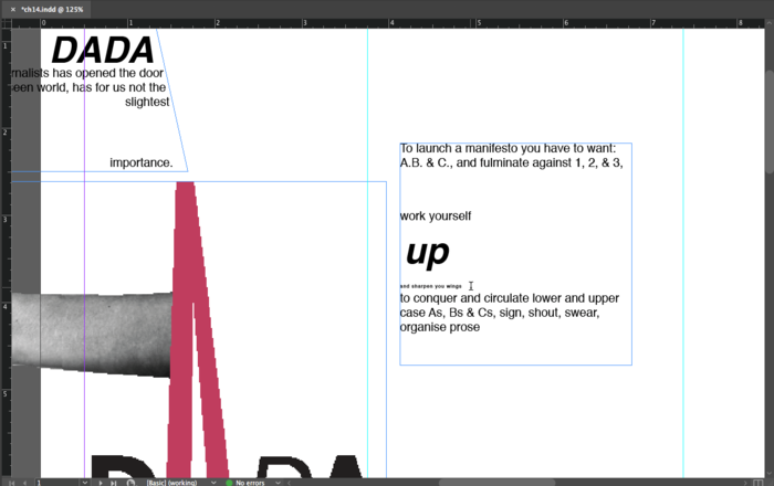
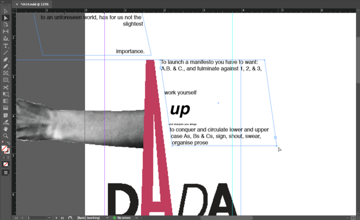
10. Set the typography in the next text frame and send it behind the title graphic using Object > Arrange > Send to Back. Set the word, “up” in Helvetica bold oblique 30. Notice the kerning in the phrase "and sharpen your wings," which is set at a barely legible 4 points. Increase the kerning by selecting the words and using the key command OPT+Right Arrow.
11. Use the Direct Select Tool again to make the text box lean into the letter A. Click on the bottom two anchor points (use SHFT to make both anchor points active) and move them to the right.
12. Set the next two text frames in Helvetica Regular 9/18. Create a new character style based on this setting.
13. Apply the character style to the fourth text box and use the Selection Tool to modify the width of the box on the page. Send this text box behind the title graphic. Align the left edge of the text box with the left vertical guide.
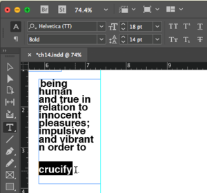
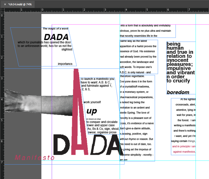
14. Set the type in the text frame from “being human…” to “crucify” in Helvetica Bold 18/14, which tightens the leading and creates tension in the typography. The letters overlap because the space between the rows of letters is smaller than the size of the letters. This type treatment could be difficult to read. However, at a larger font size than body copy (typically 9 – 11 points), a small section of text with tight leading creates tension and remains legible. Open the leading a lot for the word, “boredom” at the bottom of the text frame. In the illustration below you can see the type settings we used, but try seeing this with your eyes and intuition. Use the cursor to highlight the word “boredom” then use the key command OPT+Down Arrow to open the leading. Align the right side of the text box with the right vertcal guide.
15. Set the type in the next text frame using the character style Helvetica 9/18 by selecting the text with the Type Tool and then clicking once on the character style in the Character Styles Palette. Highlight the text through the word "things" then use the color palette to change the shade of black to 75%. Select the remaining text in this frame with the Type Tool. Use the Eyedropper Tool to pick up the pink hue from the letter "A" in the title graphic.
16. Set the 7th frame on the page about 10 units to the right of the guide (SHFT+Right Arrow) using Helvetica Regular 10/12.
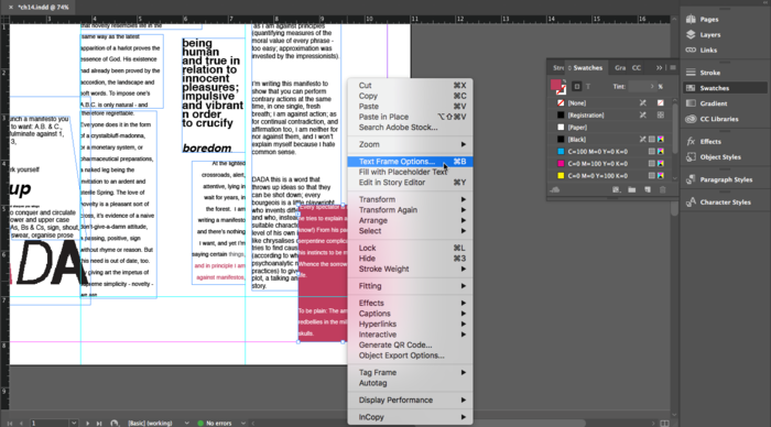
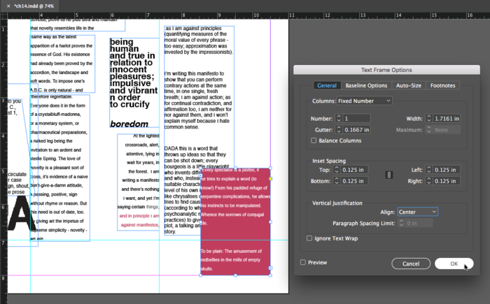
17. The next frame is placed slightly on top of the last one, so some of the words will be hidden. Select the text frame with the Selection Tool and use the character style, Helvetica 9/18. With the text frame selected, use the Eyedropper Tool to select the pink hue from the “A” in the title graphic again. This will put pink into the background color of the frame. Highlight the text and click on the White color swatch from the swatches panel. To create margin space inside the text frame use CTRL+Click on the text frame and choose “Text Frame Options…”
| Watch Out: Make sure that the fill is on top when loading the text frame background color. If the stroke icon is on top of the fill in the bottom of the Tool Palette, the text frame will be outlined instead of filled. |
18. In the Text Frame Options dialog box, use the link icon inside the “Insert Spacing” section to insert the same amount of margin padding all the way around the text frame. We used .125 inches of padding on the top, bottom, left and right sides of the text frame. Also, use the Vertical Justification Align pull down menu to vertically align the copy to the center of the text frame. Notice the copy is still left justified.
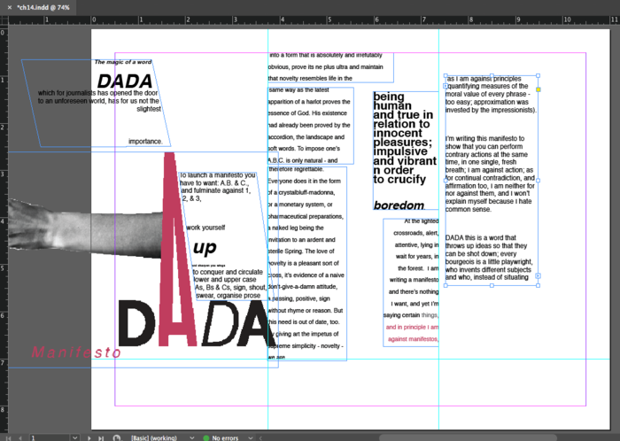
19. Create a new text box that will be placed across the two-thirds of the page from the first guide to the right margin. We would create this text box on the Artboard, then position it in place once the typography is treated. Type in, "I’m writing this manifesto to show that you can perform contrary actions at the same time, in one single, fresh breath;". This is a pull-quote from Tzara's manifesto, which you can copy and paste if you can find it in the Word Document. Sometimes it is faster to type a sentence. If you type anything new, always use the spell check available from the Edit menu. Highlight the text and use the Eyedropper again to pick up the pink hue from the “A” in the title graphic. Use the color palette to decrease the value by setting the tint to 75%. To do change the tint, you will need to add the pink hue to the swatches panel. Use the Character or Control Palette to set the type to Helvetica bold oblique 60/68. Send the text frame to the back using Object > Arrange > Send to Back.
| Tip: If you are trying to select an object in InDesign that is behind other objects, and it seems nearly impossible to select the object in the back, CMD+clicking in the same area will tell InDesign to select behind whatever is on top. |
Press "w" on the keypad to change the screen mode. Now it is easy to see the page design without guides and frame edges in the way. The following image illustrates what the first page should look like.
Exercise 2: Using text frame options, hue, and saturation to create contrast on page two
1. Start by repositioning the text box on page two into the first column and link the remaining text into a box in the second column. Select all of the text and apply the character style, Helvetica 10/12.
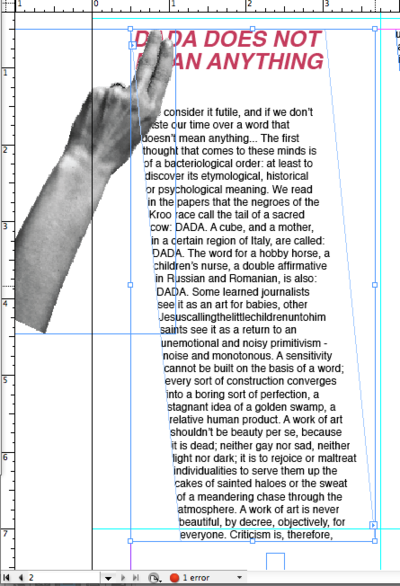
2. Select the headline "DADA DOES NOT MEAN ANYTHING" with the Type Tool and change the typography to Helvetica Bold Oblique 21/25.2. While the headline is selected, use the Eyedropper Tool to pick up the pink hue from the title graphic. Click File > Place and browse to the file included on the disk titled "hand-page2.ai.” Use the Selection Tool to position the hand over the text.
| Watch Out! Placing an Illustrator file into an InDesign file prompts InDesign to make the Direct Selection Tool active. Be sure to use the Selection Tool to move the hand without moving its clipping mask. |
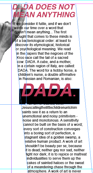
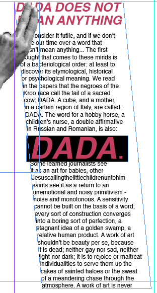
3. Create a dynamic line on the page by shifting the bottom two anchor points of the text column to the right with the Direct Selection Tool. Adjust the second text box to follow a similar line.
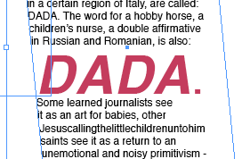
4.Move the text box edge to make the column narrow while watching the sentence fragment, "a double affirmative in Russian and Romanian, is also: DADA." Modify the width of the text box until the word “DADA” is at the beginning of a new line.
5.Adjust the typographic treatment of the word, “DADA.” We used Helvetica Bold Oblique 50/46. Look closely at the kerning. We made two adjustments.
| Tip: In Chapter 4 there are details and images related to adjusting kerning and leading in Adobe Illustrator. In chapter 13 we modified kerning in InDesign. Kerning and leading can be adjusted in the same way in all Adobe programs. |
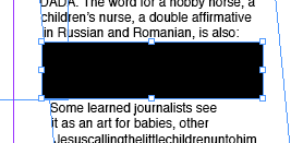
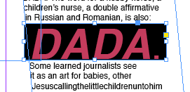
6. Draw a rectangle with the Rectangle Tool on top of the word “DADA”. Fill it with black by clicking on Black in the Swatches Palette. Click Object > Arrange > Send to Back. Adjust the leading for the next line of type.
7. Notice that if we try to fix the space at the top of the column by placing the Type Tool into the empty space and using the Delete Key, the black box behind the word DADA will also need to be adjusted. Eliminate the top space, then CMD+Click on the black box. CMD+Click selects objects beneath whatever is on top. In this situation, the text box is on top of the black rectangle. When you try to click on the black box you activate the text box (which is frustrating when you are trying to select the object beneath it). Once the black box is selected use the Up Arrow Key to move it into place.
8. Use the Selection Tool to shorten the height of the text box in the second column. Click and drag the center anchor point towards the top of the page. Create a frame break (Type > Show All Menu Items > Insert Break Character > Frame Break) after the words, "We don't accept any theories."
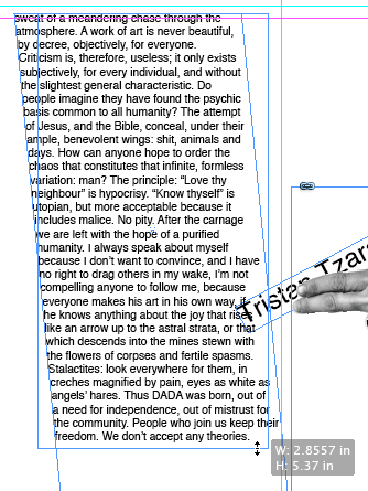
9. Click the red plus sign to load the rest of the text into the Selection Tool and draw the new text box beneath the first one in the second column. Use the Direct Selection Tool to drag the lower left anchor point to the left, creating a diagonal column with the left margin slanting in the opposite direction of the first text box. Use the character style Helvetica 9/18. Use the Eyedropper Tool and title graphic to change the color of the text.
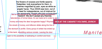
10. Cut the last line "IN 1916 AT THE CABARET VOLTAIRE, ZURICH" and paste it in a new text box. Place the box so that the left edge covers the word, "have" after "Rhymes" in the pink copy and the word, "CABARET" is after the fold on the title page. Load pink from the title graphic into the background of the text box and vertically center the type using Text Frame Options or CMD+B. Color the text white by highlighting it and clicking on the white swatch in the swatches panel. Set the font to Helvetica Bold Oblique.
11. Create the four letters “d A d A” in separate text boxes using an italic serif font. We used Adobe Garamond Pro Bold Italic 16/19.2. Use the Rotate Tool to modify both As so they appear upside down. Create a black rectangle and use the Direct Selection Tool to modify its anchor points. The shape repeats the angle of the text box above it. Select the letter "d" on top of the box and use the Swatches Palette to make it white.
| Tip: Hold SHFT while dragging the Rotate Tool to rotate an object in 45 degree increments. |
12. Create a new text box on the Artboard. Type "How can anyone hope to order the chaos that constitutes that infinite, formless variation: man?" Select the type and change its formatting to Helvetica Bold Oblique 84/94.8. While the type is still selected, use the Eyedropper Tool to make it pink by sampling a pink area in the title graphic. Use the Color Palette to reduce the transparency to 60%. Place the text box on top of all of page two. Place it behind all other elements with Object > Arrange > Send to Back. Press "W" on the keyboard to see the page without guides or objects falling onto the Artboard.
