Difference between revisions of "Chapter 5 CC18"
(→Exercise 3: Interaction of values: Updated screenshots, bolded numbers, text edits.) |
m (→Exercise 4: Interaction of colors: Text Edit) |
||
| (5 intermediate revisions by the same user not shown) | |||
| Line 62: | Line 62: | ||
Caption: ''Porträt der Frau Manet auf blauem Sofa'', Edouard Manet, 1880, oil on canvas. Complementary colors are used in Manet's painting to create contrast between the blue couch and woman in the foreground and the orange wall in the background. | Caption: ''Porträt der Frau Manet auf blauem Sofa'', Edouard Manet, 1880, oil on canvas. Complementary colors are used in Manet's painting to create contrast between the blue couch and woman in the foreground and the orange wall in the background. | ||
| − | =Exercise 1: Hue has | + | =Exercise 1: Hue has Value!= |
'''1.''' Create a new document in Illustrator using basic CYMK color mode in landscape orientation. Adjust the settings so the units are measured in inches and choose letter from the Print menu. We named our document hue-has-value. | '''1.''' Create a new document in Illustrator using basic CYMK color mode in landscape orientation. Adjust the settings so the units are measured in inches and choose letter from the Print menu. We named our document hue-has-value. | ||
| Line 98: | Line 98: | ||
[[File:Fig5 Ex1 07 CC2018.png|600px]] | [[File:Fig5 Ex1 07 CC2018.png|600px]] | ||
| − | =Exercise 2: Top or | + | =Exercise 2: Top or Bottom?= |
'''1.''' Create a new file in Illustrator using basic CYMK color mode in landscape orientation. | '''1.''' Create a new file in Illustrator using basic CYMK color mode in landscape orientation. | ||
| Line 134: | Line 134: | ||
[[File:Fig5 Ex2 05 CC2018.png|500px]] | [[File:Fig5 Ex2 05 CC2018.png|500px]] | ||
| − | '''6.''' Option-Drag your square to the left to create a copy (holding down shift after you start dragging will retain it to a movement along the x-axis). Align the bottom of the new square to the horizontal guide, and the left side of the square to the vertical on the left side of the page. | + | '''6.''' Option-Drag your square to the left to create a copy (holding down shift after you start dragging will retain it to a movement along the x-axis). Align the bottom of the new square to the horizontal guide, and the left side of the square to the vertical guide on the left side of the page. |
'''7.''' Repeat this action to make a copy of the square to the right, once again aligning the bottom edge with the horizontal guide and the left edge with the vertical guide farthest to the right. This will give your squares even spacing | '''7.''' Repeat this action to make a copy of the square to the right, once again aligning the bottom edge with the horizontal guide and the left edge with the vertical guide farthest to the right. This will give your squares even spacing | ||
| Line 173: | Line 173: | ||
[[File:Fig5 Ex2 16 CC2018.png|600px]] | [[File:Fig5 Ex2 16 CC2018.png|600px]] | ||
| − | =Exercise 3: Interaction of | + | =Exercise 3: Interaction of Values= |
'''1.''' Create a new document in landscape orientation. | '''1.''' Create a new document in landscape orientation. | ||
| Line 185: | Line 185: | ||
| − | '''3.''' Open the Layer Palette (Windows > Layers). The gray shape should be located on Layer 1. Lock Layer 1 so that the gray shape does not move while completing the following steps. | + | '''3.''' Open the Layer Palette (Windows > Layers). The gray shape should be located on Layer 1. Lock Layer 1 so that the gray shape does not move while completing the following steps. There should appear a small lock icon between the eye and the Layer name, indicating the layer is locked. |
[[File:Fig5 Ex3 03a CC2018.png]] | [[File:Fig5 Ex3 03a CC2018.png]] | ||
| Line 209: | Line 209: | ||
Notice how the middle gray squares inside the black and white areas appear to have different values. When values are placed near or on top of each other, we perceive their values as interacting and affecting one another. It is important to keep this in mind when choosing hue and value combinations, as one value will always influence the appearance of another. | Notice how the middle gray squares inside the black and white areas appear to have different values. When values are placed near or on top of each other, we perceive their values as interacting and affecting one another. It is important to keep this in mind when choosing hue and value combinations, as one value will always influence the appearance of another. | ||
| − | =Exercise 4: Interaction of | + | =Exercise 4: Interaction of Colors= |
And now for the magic trick: in the next exercise three colors appear as four colors. | And now for the magic trick: in the next exercise three colors appear as four colors. | ||
| − | 1. Re-save your Exercise 3 file with a new name using File > Save As. | + | '''1.''' Re-save your Exercise 3 file with a new name using File > Save As. |
| − | 2. Shift select the two smaller squares and use the Color Picker or the Color Sliders (Window > Color) to assign the same hue to them. | + | '''2.''' Shift select the two smaller squares and use the Color Picker or the Color Sliders (Window > Color) to assign the same hue to them. |
| − | [[File: | + | [[File:Fig5 Ex4 02 CC2018.png|600px]] |
| − | 3. Select the larger square on the left (in this example, the white square is selected) and assign it a middle value and a complementary hue to the hue you just chose for the smaller square. You can use the Color Picker or the Color Palette, or you can "cheat" and follow these steps to find the complementary color: | + | '''3.''' Select the larger square on the left (in this example, the white square is selected) and assign it a middle value and a complementary hue to the hue you just chose for the smaller square. You can use the Color Picker or the Color Palette, or you can "cheat" and follow these steps to find the complementary color: |
| + | '''a.''' Select the large square to the left, then use the Eye Dropper Tool to click on the smaller square. This will fill the large square with the same exact color that you used in the inside smaller square and for a moment, there will be no distinction between these two shapes and the smaller square disappears. The large square remains selected, so do the next step before you accidentally deselect! | ||
| − | + | '''b.''' While the large square is still selected, use the pull-down menu from the top right corner of the Color Palette to choose "Complement." This will assign the exact complementary color (in the color model that you have assigned to your document) to the larger square. | |
| − | + | [[File:Fig5 Ex4 03b CC2018.png|400px]] | |
| − | + | '''c.''' Select the larger square on the right (in our example, the black square) and assign it an analogous hue to the hue of the smaller square (ours is green) with a middle gray value. We used the Color Picker this time to choose an analogous hue, see the screenshot for clarification. | |
| − | |||
| − | + | [[File:Fig5 Ex4 03c CC2018.png|600px]] | |
| − | [[File: | ||
First we used the Eye Dropper Tool to set the fill of the larger, black square to the same hue/value combination used in the small square (a repeat process from step a). Then in the Color Picker, we slid the hue cursor up slightly for the analogous hue and a little to the left for a value closer to middle gray. | First we used the Eye Dropper Tool to set the fill of the larger, black square to the same hue/value combination used in the small square (a repeat process from step a). Then in the Color Picker, we slid the hue cursor up slightly for the analogous hue and a little to the left for a value closer to middle gray. | ||
| − | d. Notice that the two small squares look like they are different colors. They are, in fact, the same color, but the presence of the complementary and analogous colors influences our perception. The complementary color emphasizes the perception of the hues, and the analogous color subtracts the perception of the hues. | + | '''d.''' Notice that the two small squares look like they are different colors. They are, in fact, the same color, but the presence of the complementary and analogous colors influences our perception. The complementary color emphasizes the perception of the hues, and the analogous color subtracts the perception of the hues. |
| − | [[File: | + | [[File:Fig5 Ex4 03d CC2018.png|600px]] |
Latest revision as of 15:12, 7 September 2018
Download Materials for Chapter 5
Click here to download chapter 5 work files.
Chapter 5: Color Theory & Basic Shapes
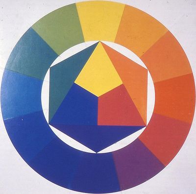
German Bauhaus school educators Josef Albers and Johannes Itten helped define and expand upon color theory during the years 1919 - 1923. Albers created a course in color theory that inspired the tutorial in this chapter. Students who attend art and design universities typically complete these color studies using pigment and brushes or with Color-Aid paper, however formal color studies are demonstrated in the digital environment with the following four exercises where hue, value, and contrast are exploited to achieve various color relationships.
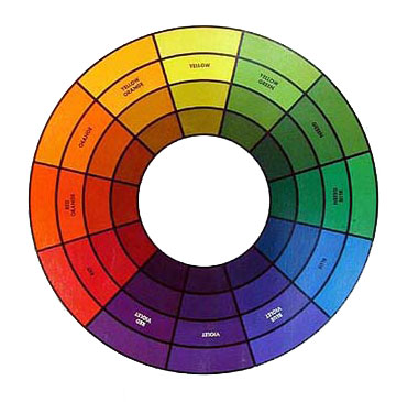
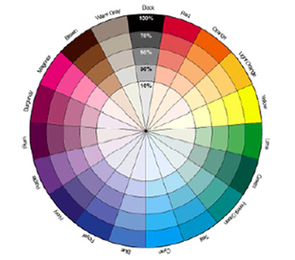
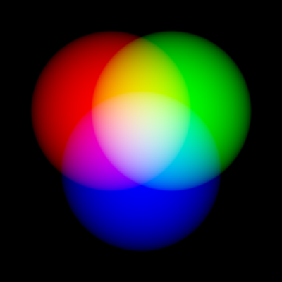
The traditional (analog) color wheel utilizes the RYB (red-yellow-blue) color model. In this subtractive color model, red, yellow, and blue are the primary hues (what we think of as colors), which can be mixed together to create any other color within the color wheel. Opposite colors on the wheel are called complementary, while analogous colors sit side-by-side on the wheel. When the primaries are mixed together in the subtractive system, the resulting product is black. In the digital spectrum, the RGB (red-green-blue) additive color system is used on television screens and computer monitors. Colored light is mixed to create hue and value with red, green and blue as the primary colors. When the primary colors in the RGB model are mixed together, the result is white.
The CMYK (cyan, magenta, yellow, and black) color model is another digital spectrum that is specific to the print industry. Artists and designers often create high volumes of printed media using the CMYK color model to synchronize the digital file with the four corresponding printing plates. This system is also subtractive, even though it is utilized in a digital environment, so mixing equal parts of cyan, magenta, yellow and black produces black. The CMYK color mode enables digital producers to access Pantone® colors, a set of industry specific colors that are made to render a clear translation between the color that is presented on the screen and the color that will result from the printer's equipment.
IMAGE: http://www.flickr.com/photos/digitalfoundations/2229001807/ or
http://en.wikipedia.org/wiki/Image:Farbkreis_Itten_1961.png
Caption: Farbkreis, Johannes Itten, 1921
IMAGE: http://commons.wikimedia.org/wiki/Image:Additive_RGB_Circles-48bpp.png
Caption: RGB Color Wheel
Vocabulary
- Hue is color (e.g. red, blue, green, yellow)
- Intensity, Saturation, Chroma and Brilliance all refer to how much pigment is in a color, which translates to how vivid a color appears.
- Value is measured by how much white or black is mixed with a hue, or, it can be registered as the grayscale equivalent of a color.
- Shades are a hue mixed with black.
- Tints are a hue mixed with white.
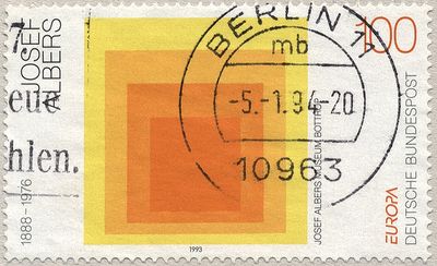
- Analogous colors are adjacent on the color wheel.
IMAGE: http://www.flickr.com/photos/digitalfoundations/2229001663/
Caption: Homage to the Square, Joseph Albers, 1950 - 1975. Analogous colors are demonstrated on this stamp, featuring one of Albers' homages. Albers began working on this series in 1950 and made thousands of works addressing the square over the course of twenty-five years.
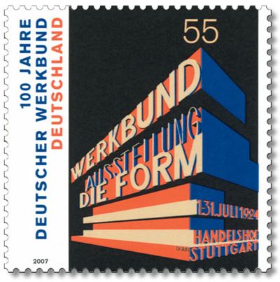
- Complementary colors directly oppose each other on the color wheel.
IMAGE: http://commons.wikimedia.org/wiki/Image:100_Jahre_Deutscher_Werkbund_-_Postwertzeichen.jpg
Caption: Jahre Deutscher Werkbund, stamp, Germany. Complementary colors are utilized in this stamp celebrating Jahre Deutscher Werkbund.
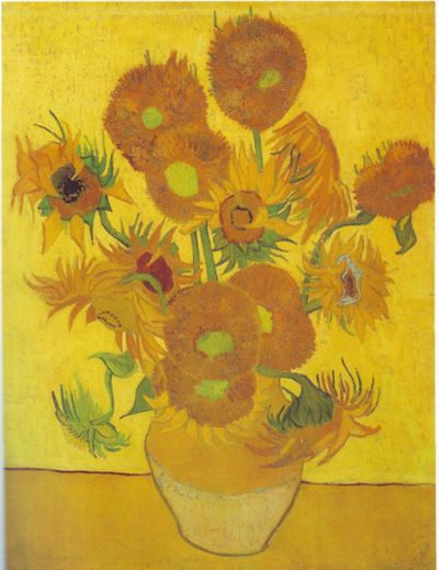
IMAGE: http://commons.wikimedia.org/wiki/Image:Vincent_Van_Gogh_0010.jpg
Caption: Sunflowers, Vincent Van Gogh, 1888, oil on canvas. Analagous colors are used to in Van Gogh's sunflowers to create color harmony.
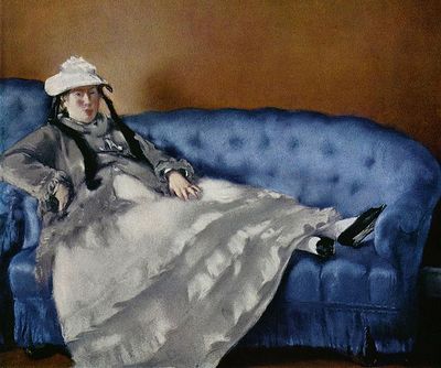
IMAGE: http://www.flickr.com/photos/digitalfoundations/2229000351/
Caption: Porträt der Frau Manet auf blauem Sofa, Edouard Manet, 1880, oil on canvas. Complementary colors are used in Manet's painting to create contrast between the blue couch and woman in the foreground and the orange wall in the background.
Exercise 1: Hue has Value!
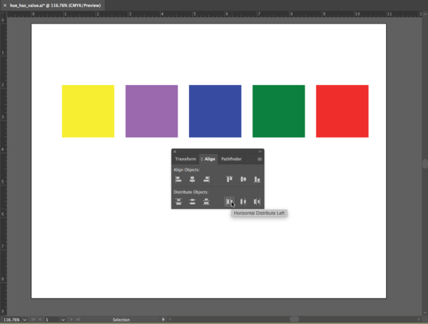
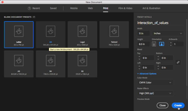
1. Create a new document in Illustrator using basic CYMK color mode in landscape orientation. Adjust the settings so the units are measured in inches and choose letter from the Print menu. We named our document hue-has-value.
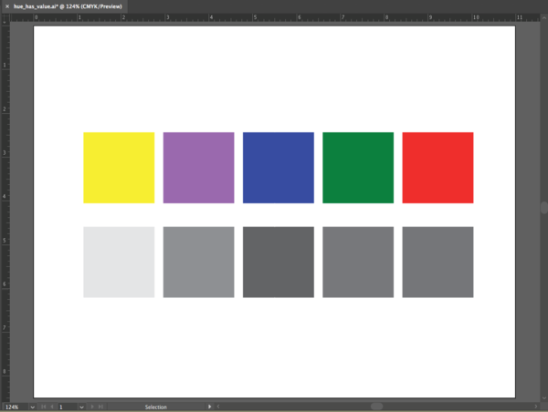
2. Using the Rectangle Shape Tool, draw five squares on the Artboard. Hold down the shift key (SHFT) while dragging each square to keep the proportions equal. Evenly distribute the squares by clicking "Horizontal Distribute Left" under the Align Panel (Windows > Align) as we did in chapter 3.
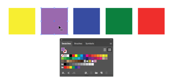
3. For each square, choose a fill color of a different hue with different values. Do not use a stroke. Remember to select the shape before you select a new color from the Swatches or Color Panel.
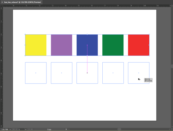
4. Select all of the shapes by marqueeing over all of them with the Selection Tool or hold SHFT and click each shape with the Selection Tool. Hold the option key (OPT) while dragging the squares to create a duplicate set. If you hold the shift key after you begin dragging the mouse, the duplicate copy will move only in straight or 45 degree movements.
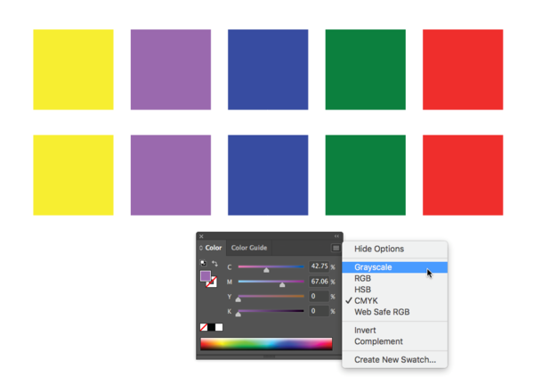
5. Select one of the duplicate squares with the Selection Tool then click on the Color Palette pull-down menu (located in the top right area of the Color Palette) and choose "Grayscale." This removes the Hue from the square and results in demonstrating the value of the associated hue. Repeat this step for each of the squares in the duplicate set.
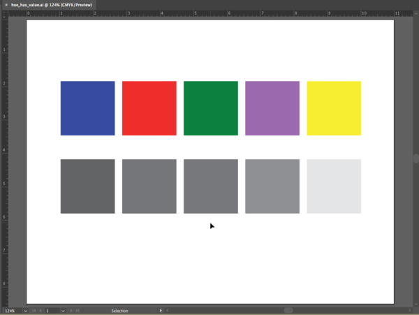
6. Observe how each hue has an associated value.
7. Rearrange the color-grayscale pair according to the grayscale value, with the closest to white at the right, and black at the left. Select each pair (either by marqueeing with the selection tool, or SHFT-clicking on one square followed by the next) and drag it left or right in the grayscale order. Be sure to hold down shift once you have started to drag the mouse as this will keep your movement strictly vertical or horizontal.
Exercise 2: Top or Bottom?
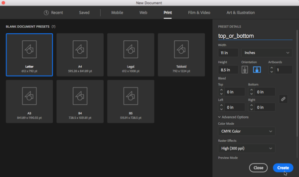
1. Create a new file in Illustrator using basic CYMK color mode in landscape orientation.
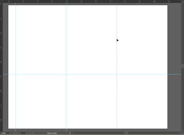
2. Use one horizontal guide and three vertical guides to divide the page. Create the guides by clicking on the ruler and dragging the cursor onto the artboard. Place the horizontal guide at 4.75 inches, which is half an inch below the center of the page. Place three vertical guides at .5, 4 and 7.5 inches. If you don't see your rulers, turn them on by clicking View > Rulers > Show Rulers (CMD+R).
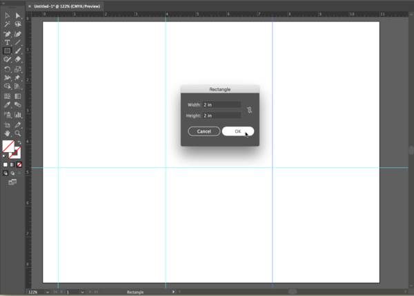
3. Create a 2 x 2" square on the top half of the page. Align the bottom of the square to the horizontal dividing line and the left edge to the middle vertical guide. To make the square exactly 2 by 2", double-click on the art board with the Rectangle Tool to see the Rectangle Options Dialog Box. Type "2 in" into the horizontal and vertical measurement boxes.
| If the dialog box is set to a different unit of measurement when it first opens, for instance points or pixels, typing "2 in" tells the program to use inches instead of the units of measurement that initially appeared in the dialog box. |
Using the Color Picker
4. Colors have three properties: Hue, Value and Saturation. Hue is the name used to define the color. For instance red, yellow, blue, and so on, are hues. Value refers to how much white or black is mixed into the color. Baby blue has white in it, while navy blue has a greater black value. Saturation is the level of intensity of the color. The color of pale winter tomatoes are less saturated than the color of ripe summer tomatoes.
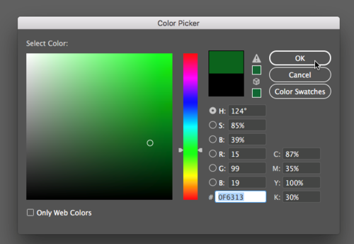
Double-click on the fill color in the bottom of the Tool Palette. The Color Picker dialog box appears. The Color Picker is another location for choosing colors. The Color Picker has controls for all three properties, hue, value and saturation. Choose a hue on the vertical slider to the right of the color selection area. Then choose a value by moving the color selection circle up or down vertically. The higher you move the circle, the higher the value and the lighter the color appears. The lower the circle is placed correlates to a lower value and the color becomes darker. Choose a saturation by moving the color selection circle left or right horizontally. The further to the left the circle is moved, the lower the saturation. The color becomes more gray. The more right you move the circle, the higher the saturation value, and the more intense the color becomes.
5. Make sure that the square is selected before choosing a color in this step. Use the Color Picker to choose a hue with a low value for the fill color of the square. Do not assign a stroke.
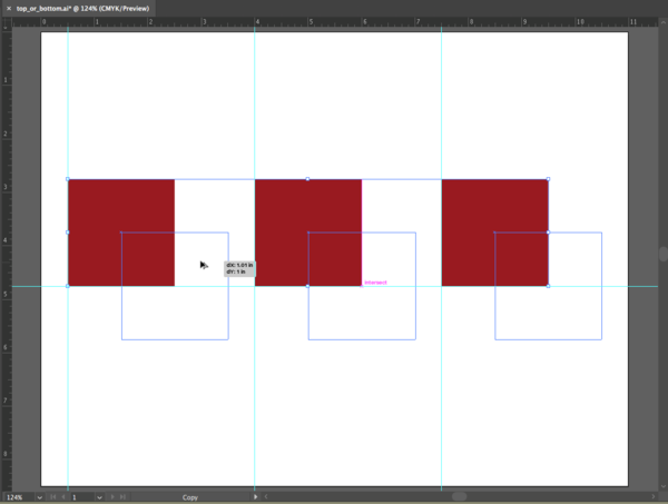
6. Option-Drag your square to the left to create a copy (holding down shift after you start dragging will retain it to a movement along the x-axis). Align the bottom of the new square to the horizontal guide, and the left side of the square to the vertical guide on the left side of the page.
7. Repeat this action to make a copy of the square to the right, once again aligning the bottom edge with the horizontal guide and the left edge with the vertical guide farthest to the right. This will give your squares even spacing
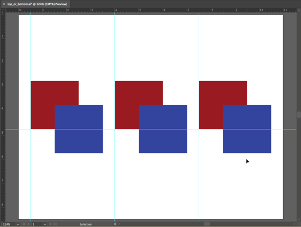
8. Select all three of the squares and Option-drag them down to the right so that 1 inch of the upper left corner of the new squares overlap with 1 inch of the bottom right corner of the original squares. Hold down the shift key to drag the squares at a 45 degree angle.
9. Give all three of the new squares a different hue with a higher value from the top three: With all three squares selected, double click on the fill square to bring up the color picker. Choose a different hue, and choose a higher value so the color has less black in it.
10. Select the left set of two squares (drag with the Selection Tool, or shift-click with the Selection Tool).
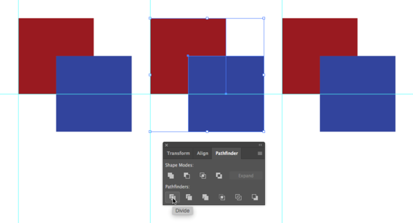
11. With the two shapes selected, open the Pathfinder Palette (Window > Pathfinder). Click on the "Divide" button, the first button under the Pathfinder heading. Dividing two objects creates a new shape at the intersection of the paths. The overlapping space is the one inch square. It will become its own whole shape, and the three shapes will remain grouped.
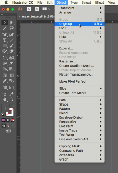
12. Select all three shapes and ungroup them by clicking Object > Ungroup (CMD+SHFT+G). Now they can be selected and treated individually.
13. Repeat steps 10-12 with the middle and right set of squares.
Creating foreground and background depth using hue and value
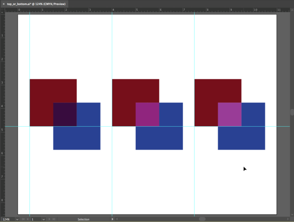
Now we will modify the color of the middle squares, starting with the left square. The purpose of this exercise is to see how hue and value can be used to create space or depth within a color field. You will set the middle colors to see how that middle square can be pulled forward or pushed back in space, in relationship to the other two squares.
14. For the left set of squares, modify the center square such that it is part of the top square, and both it and the top square are floating above the bottom square. Achieve this by choosing a hue and value that creates strong contrast with the bottom square (you will especially see this at the boundary between the two shapes), and little or no contrast in value with the top square.
15. For the center set of squares, modify the smaller middle square such that it is floating over both of the larger squares. This is achieved by choosing a hue and value that creates strong contrast with both of the other squares.
16. For the right set squares, modify the smaller middle square such that it is part of the bottom square, and both it and the bottom square are floating over the top square. This effect is achieved by choosing a hue and value that creates strong contrast with the top square, and little or no contrast with the bottom square.
Exercise 3: Interaction of Values
1. Create a new document in landscape orientation.
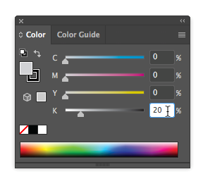
2. Use the Rectangle Tool to create a 20% gray rectangle that covers the whole Artboard, by using the CMYK color sliders to set the K value to 20% and all other sliders to 0%. Display color sliders by clicking on the drop-down menu in the top right corner of the Color Panel and selecting "Show Options", or by clicking on the tiny icon to the left of the "Color" label on the panel tab that toggles the options for the panel.
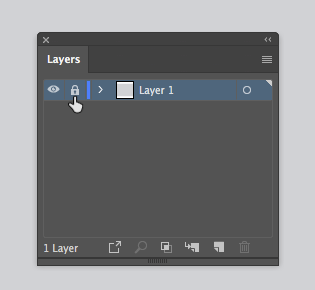
3. Open the Layer Palette (Windows > Layers). The gray shape should be located on Layer 1. Lock Layer 1 so that the gray shape does not move while completing the following steps. There should appear a small lock icon between the eye and the Layer name, indicating the layer is locked.
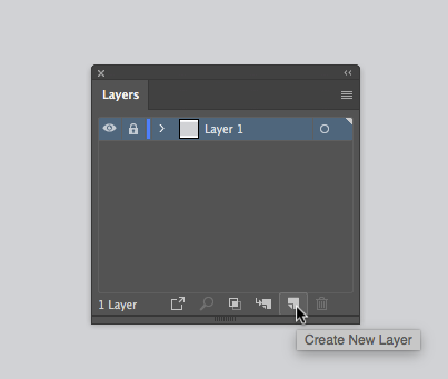
Create a new layer using the button at the bottom of the Layer Palette.
4. With Layer 1 locked and Layer 2 selected (highlighted in the Layer Palette), the following steps will be accomplished on Layer 2.
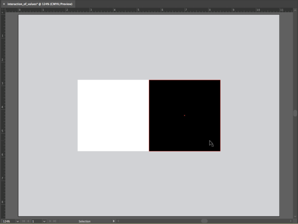
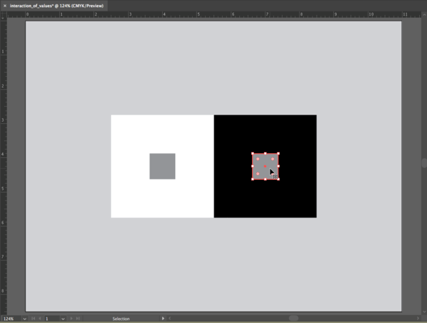
5. Create Two 3" x 3" squares on top of the gray background. Fill one with white, eliminate any stroke color, and fill the other with black. Place the squares side by side, so that the left edge of one touches the right edge of the other in the middle of the gray area.
6. Create one .75" x .75" square in the center of the white square. Fill the square with 50% black (middle gray).
7. Option-drag a copy of this square to the middle of the black square with the Selection Tool.
Notice how the middle gray squares inside the black and white areas appear to have different values. When values are placed near or on top of each other, we perceive their values as interacting and affecting one another. It is important to keep this in mind when choosing hue and value combinations, as one value will always influence the appearance of another.
Exercise 4: Interaction of Colors
And now for the magic trick: in the next exercise three colors appear as four colors.
1. Re-save your Exercise 3 file with a new name using File > Save As.
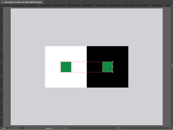
2. Shift select the two smaller squares and use the Color Picker or the Color Sliders (Window > Color) to assign the same hue to them.
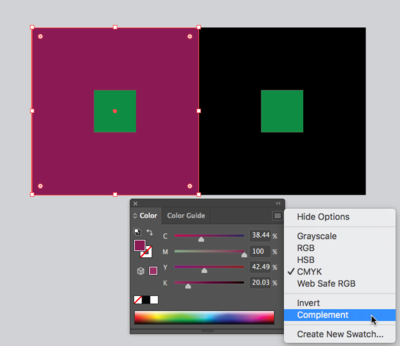
3. Select the larger square on the left (in this example, the white square is selected) and assign it a middle value and a complementary hue to the hue you just chose for the smaller square. You can use the Color Picker or the Color Palette, or you can "cheat" and follow these steps to find the complementary color:
a. Select the large square to the left, then use the Eye Dropper Tool to click on the smaller square. This will fill the large square with the same exact color that you used in the inside smaller square and for a moment, there will be no distinction between these two shapes and the smaller square disappears. The large square remains selected, so do the next step before you accidentally deselect!
b. While the large square is still selected, use the pull-down menu from the top right corner of the Color Palette to choose "Complement." This will assign the exact complementary color (in the color model that you have assigned to your document) to the larger square.
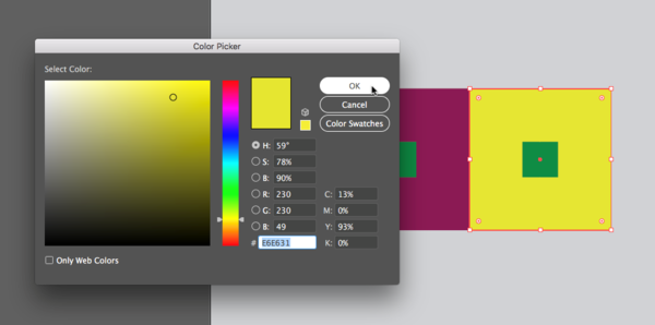
c. Select the larger square on the right (in our example, the black square) and assign it an analogous hue to the hue of the smaller square (ours is green) with a middle gray value. We used the Color Picker this time to choose an analogous hue, see the screenshot for clarification.
First we used the Eye Dropper Tool to set the fill of the larger, black square to the same hue/value combination used in the small square (a repeat process from step a). Then in the Color Picker, we slid the hue cursor up slightly for the analogous hue and a little to the left for a value closer to middle gray.
d. Notice that the two small squares look like they are different colors. They are, in fact, the same color, but the presence of the complementary and analogous colors influences our perception. The complementary color emphasizes the perception of the hues, and the analogous color subtracts the perception of the hues.
