Difference between revisions of "Chapter 12 CS6"
| Line 11: | Line 11: | ||
[[File:Firefox004_CS6.png|400px|top]] [[File:Firefox007_CS6.png|400px]] | [[File:Firefox004_CS6.png|400px|top]] [[File:Firefox007_CS6.png|400px]] | ||
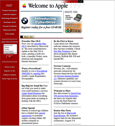
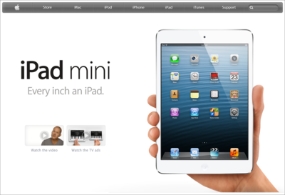
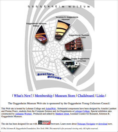
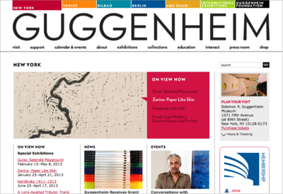
| − | From top left to bottom right: Whitehouse.gov on October 23, 1997; Whitehouse.gov on November 5, 2008; Pizzahut.com on February 14, 1997; Pizzahut.com on November 5, 2008. | + | <span style="color:red"><strike>From top left to bottom right: Whitehouse.gov on October 23, 1997; Whitehouse.gov on November 5, 2008; Pizzahut.com on February 14, 1997; Pizzahut.com on November 5, 2008.</strike> From top left to bottom right: apple.com on July 14th, 1996; apple.com on February 7th, 2013; guggenheim.org on December 27, 1996; guggenheim.org on February 7th, 2013.</span> |
<table class=”infobox”><tr><td> | <table class=”infobox”><tr><td> | ||
Note: The Wayback Machine contains an archive of over 85 billion web pages. You can use this search engine at http://www.archive.org. | Note: The Wayback Machine contains an archive of over 85 billion web pages. You can use this search engine at http://www.archive.org. | ||
Revision as of 13:55, 7 February 2013
Download Materials for Chapter 12
Click here to download chapter 12 work files.
Visual Examples
The Wayback Machine is an archive of web pages dating back to the early 1990s. We used the Wayback Machine to view web sites from the 1990s to compare them with the same sites in 2008. Notice how the aesthetics of web graphics has changed in the past two decades. These new aesthetics are possible due to increased network speed, changes in programming techniques, and the evolution of information design. Greater connection speeds result in the ability to upload and download larger files. Graphics are larger, more frequent, and more colorful on current web sites than the graphics made for the web in the 1990s.
From top left to bottom right: Whitehouse.gov on October 23, 1997; Whitehouse.gov on November 5, 2008; Pizzahut.com on February 14, 1997; Pizzahut.com on November 5, 2008. From top left to bottom right: apple.com on July 14th, 1996; apple.com on February 7th, 2013; guggenheim.org on December 27, 1996; guggenheim.org on February 7th, 2013.
|
Note: The Wayback Machine contains an archive of over 85 billion web pages. You can use this search engine at http://www.archive.org. |
Exercise 1: From digital input to web ready
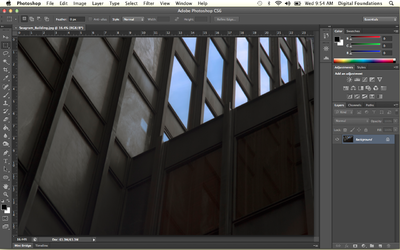
1. Download and open orbitzad1.jpgseagram_building.jpg from the wiki, or get any image from your digital camera or scanner.
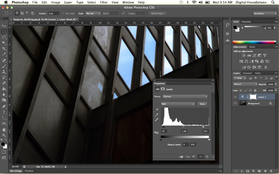
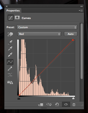
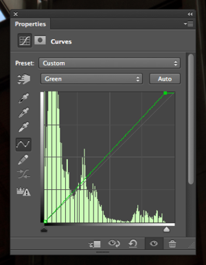
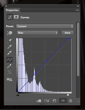
2. If you followed the exercises in Chapters 8 and 9, you should be comfortable changing the tonal range and color of this image. Adjust the tonal range and color to your liking by creating adjustment layers.
3. Save this file as a master copy by choosing Save As from the file menu, adding “_master” to the file name and then choosing PSD as the file format. We saved ours as orbitz_master.psd. seagram_building_master.psd.
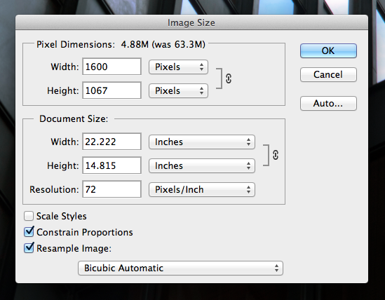
4. The image from the wiki is straight off a 7-megapixel21-megapixel digital camera, and is much larger than can be displayed on a web site. Choose Image > Image Size and notice the size of your image in pixels. Check the boxes next to Resample Image and Constrain Proportions, then change the pixel dimensions at the top of the box so the largest dimension is no larger than 1600px. If your image is less than 1600px on its long side, you can use the Cancel button to close this dialog box without making any changes.
|
Tip: Monitors generally have display settings such as 1280 by 800 or 1024 by 768 pixels. A file whose longest side is 1600px is likely more than big enough to fill a web browser window on any monitor. The only measurement unit relevant to us in this exercise is pixels, as the image will be shown on a platform that also uses pixels. |
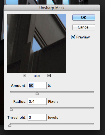
5. Add an unsharp mask (Filter > Sharpen > Unsharp Mask). Make sure you have the image layer selected, and not one of the adjustment layers. We used the following settings for the Orbitz ad photo: Amount, 25%; Radius, .6px; Threshold 0 levels. Your image may require different settings.
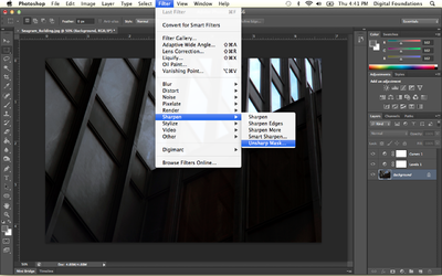
6. Choose File > Save for Web & Devices. Photoshop and Illustrator share this save for web interface. It allows you to compress your images, flatten layers, and prepare an image for the web.
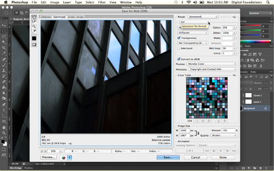
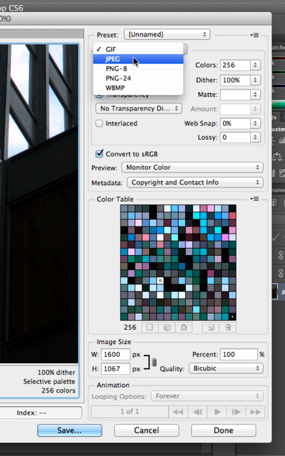
7. The Save for Web & Devices dialog has several important parameters to set. The most important parameter is the Optimized file format. As a general rule, photographic images and other images with more than 256 colors are saved as JPEGs. Graphic images — images with few colors such as logos and line art — are saved as GIFs or PNGs. Since this image is a photograph, select JPEG from the Format pull-down menu.
8. Select the default quality of High, or 60. Saving a file for the web compresses the saved image into a smaller file size by removing color information and pixel detail. This is called lossy compression.
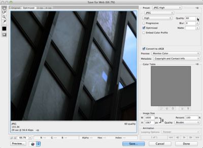
| Note: The human eye cannot detect image compression artifacts if used with a light touch and when the image is viewed on a computer screen. Compression runs from Low to Maximum, and corresponds to a numerical range from 0 to 100. Zero is a very low quality, where you will definitely be able to notice the loss of quality in the image, while the maximum 100 level, although still having had image data thrown away, shows no visible decline in quality. The trade-off is that more compression creates a smaller file. Weigh your needs for file size against your perception of image quality to decide what level of compression to use. |
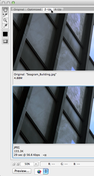
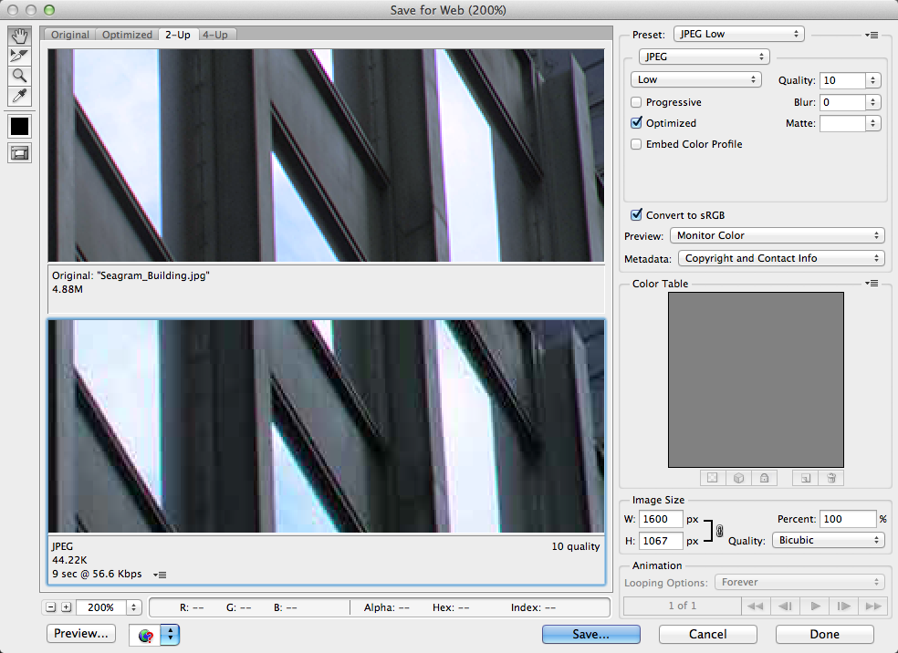
9. Click on the 2-Up tab to show the original image in its native format next to the compressed image. Notice that the original image has a file size of 5.49MB4.88MB, and the file size of the optimized image is 368KB155.3KB. The compressed image is 15% of the original file size.. This is important because the smaller the file size is, the faster the image will download as part of a web page.
| Tip: The zoom and hand tools allow you to get a closer look at the image and move to important details. |
10. Reduce the quality to Low, or 10. Notice how much detail is lost. Visible compression artifacts are introduced into the image. Our file size is much smaller at 85KB 44.2KB, but we have compromised too much image quality for the sake of the smaller file size.
| Tip: If your settings disappear, click on the lower preview window. |
11. Return the Compression quality setting to High, and click the Save button.
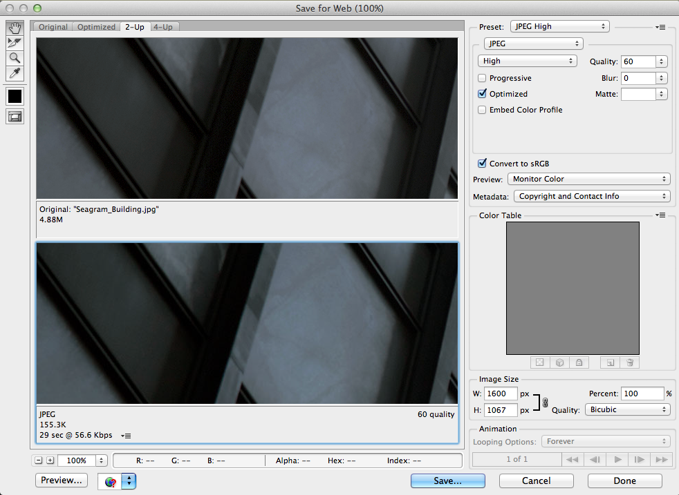
12. Name your file with an underscore and the word “web” like we did when we named ours orbitzad_web.jpg sea gram_building_web.jpg, and save it to the Desktop. Remember web standards when naming files: only use lowercase alphanumerics, underscores, and dashes.
13. Close and do not save the orbitz_master.psdseagram_building_master.psd that is currently open. (We saved the master file in Step 3 before scaling the image and we don’t want to save this smaller version over it.)
| Watch Out: When you open the file and resize it, it is no longer the master file. This may seem confusing, but it is a situation you will commonly experience when maintaining master files and resized web ready files. There’s nothing stopping you from using Save As to save your scaled-down master file as well, but it’s probably overkill and could mislead you later into believing it’s the largest version you have. |
14.Open the JPEG you just saved for web (ours is orbitzad_web.jpg)(ours is seagram_building_web.jpg) in Photoshop, and notice that there are no adjustment layers. By saving for the web, we flattened the image.
Exercise 2: GIF vs JPEG
As stated in Exercise 1, photographic images with many colors are saved as JPEG files, and graphic images with few colors are saved as GIFs. Following these rules will produce better images and smaller file sizes.
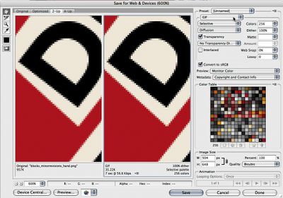
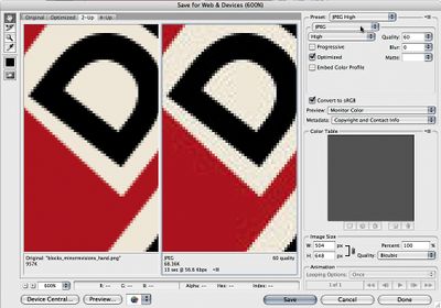
Notice in the above images, the photograph saved as a GIF file is larger and of lower visual quality than the photograph saved as a JPEG file. Likewise, the graphic saved as a JPEG has a larger file size with a lower image quality than the graphic saved as a GIF.
Exercise 3: Uploading to Flickr
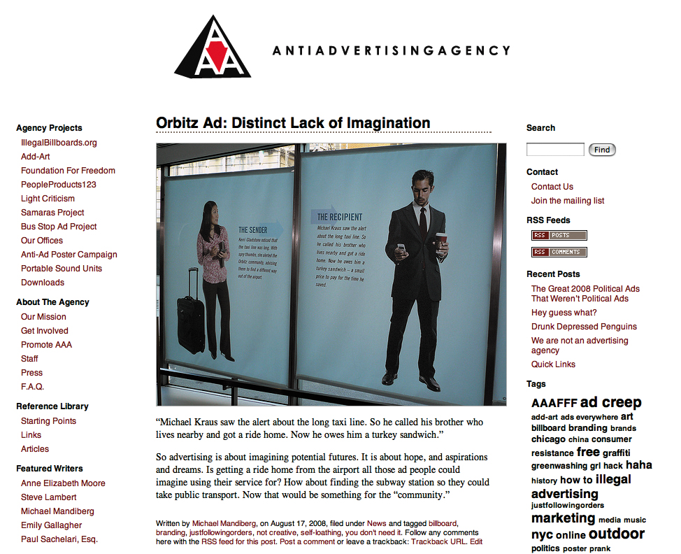
We will upload this photo to Flickr, and then post it to a WordPress blog in the next exercise. Our example was a post to the blog maintained by the Anti Advertising Agency (http://antiadvertisingagency.com/). In their words, “The Anti-Advertising Agency co-opts the tools and structures used by the advertising and public relations industries.... Through constructive parody and gentle humor our Agency’s campaigns will ask passers by to critically consider the role and strategies of today’s marketing media as well as alternatives for the public arena.” (http://antiadvertisingagency.com/our-mission).
Our post is critical of this Orbitz ad for its lack of imagination. Advertising is one of the places where a society imagines the future, embraces technology, and constructs reality from fantasy. In this ad, the models have a lot of technology and community at their fingertips, and Orbitz advocates that the traveler call someone to pick him up at the airport, rather than directing the traveler to a website that might advise the traveler on how to locate their final destination via public transportation, such as Google Maps. Technology and advertising can change habits and practices, but only when the advertisements imagines a new and better future. Our criticism is about putting another car on the road. We are not, however, criticizing the design!
1. Login into Flickr.com. If you do not have an account already, you will need to create one. Flickr is part of Yahoo!, so either use an existing Yahoo! ID for Flickr, or create a new one. Web services like Facebook, Picasa, and others also have integrated uploader programs for free that work well, too.
2. In the Flickr interface, click on You > Upload Photos and Videos.
3. Click on Choose photos and videos. In the window that comes up, locate your JPEG (ours is orbitzad_web.jpg), and click Select.
4. Click Upload Photos and Video.
5. Click on Add a description.
6. Change the title of your file, if you would like to. In this case, we changed the name to Lack of Imagination.
7. Give the file a description, when we posted it was “An unimaginative Orbitz ad about an unimaginative use of technology.”
8. Give the file tags. Tags are what allow people to find your file in an image search. For this image, the tags are “Advertisement, Orbitz, Cell phone, suit, luggage, travel, traffic, JFK”
9. Save the image. The image is now at the front of your photostream.
10. Click on the image to navigate to the the image page.
11. Press the All Sizes button.
12. Select the 500 pixel wide Medium image.
13. Copy the code from the bottom of the page that allows you to link to your image. Navigate to your blog. We made our post at AntiAdvertisingAgency.com.
Exercise 4: Posting to a blog
While setting up and maintaining a blog is somewhat beyond the scope of this book, so many people have blogs these days, that we will assume that you either have a blog, or have used a blog. If this is not true, focus on learning how you can load an image from one web site onto another with simple, prewritten code. This is relevant for Chapters 15 – 17.
1. Every blog interface is slightly different, but all share certain procedures. First, login.
2. Click on the Write a New Post button.
3. Give your post a title. We called ours “Orbitz Ad: Distinct Lack of Imagination.”
4. Paste the image code that is in your clipboard into the post.
5. Write your post.
6. Add tags that will help a searcher land on the viewpoint you want to share. Tags are a way of categorizing and organizing the content on a site. Generally you want to use tags that you have previously used. So if you have initially used a tag “design” you probably would want to use that tag rather than introducing something like “designey” or “designed.” Working within the existing tag categories on the Anti Advertising Agency blog, we tagged our post “billboard, branding, justfollowingorders, not creative, self-loathing, you don't need it” because we are blogging about it from a critical point of view. When you are applying tags, try to put yourself in the shoes of a person searching the web. Ask yourself what words they might use in hopes of finding the content you are creating.
7. Select a category, in this case “News.”
8. Submit your post. If you are writing on your own blog, it is likely that you will click a button labeled Publish.
9. Click on the View Post link to view your post. The post we made is located at http://antiadvertisingagency.com/news/orbitz-ad-distinct-lack-of-imagination
| Tip: If you don’t already have a blog, you can get a free WordPress blog at WordPress.com. We like WordPress because there is a large community of users, great documentation, loads of themes and plug-ins, and it is open source (meaning, the source code is available for augmentation and manipulation.) Tumblr, Blogger, Moveable Type, and TypePad are also quality blog platforms. |
